SIMD again

In case you were wondering, no, I haven’t forgotten about the SIMD project. Far from it. I am finding my new space offers a definite thinking-advantage, simply by virtue of being less crowded and cluttered.

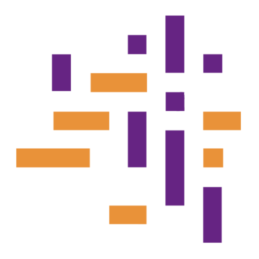
For instance, I am currently the owner of a big blank wall (although there is a plan to store table looms here by hanging them on big hooks, this plan is as yet unrealised) and so I have been trying out possible shapes and sizes with sheets of newsprint.

Each one of these rectangles represents one piece of weaving, and each piece of weaving represents a geographical area — though I haven’t decided which areas I’m going to focus on or even how many there are going to be.

I’ve also been thinking about colours, which is a tricky business. Should the colours be meaningful in some way? What meaning — or whose meaning, perhaps — should they carry? I’ve been playing around with the colour exercises from James Koehler’s class at Convergence 2010, which give me a way of developing colours associated with themes and ideas. But there is also an argument for a more functional approach, where the colours are chosen simply for visual contrast.

There is a tendency for managers who need to consider statistics to want to see them in ‘traffic light’ colours. In this scheme, green means that things are going really well and red means that there is a problem. This easily transmutes into green = goes in the annual report as a good news story, red = intervene! have a meeting! and neither-red-nor-green = ignore and do nothing. Although it can be a handy code in certain circumstances, it is also an exceedingly annoying system — as well as being a problem for anyone who is red-green colour blind. Much as I love red and green, then… I am not going to use them in that way here.

Although my pastel sketches are all wonky and messy, the colour changes I’m planning do in fact need to be very precise to represent the dataset. So I’ve also been playing around with double weave drafts and changing layers one end at a time. If I use 8 shafts for each layer then that gives me nine ‘stages’ from all-layer-one on top to all-layer-two on top with seven intermediate steps in between. I have described this plan verbally to several folk (with a lot of hand-waving and interlocking of fingers!) which means that I now feel as though I am repeating myself, even though I am pretty sure I haven’t blogged about it… Or maybe I have and I’ve just lost track in all the upheaval. Anyway, I’ll come back to this later when I get to the actual weaving part.

SIMD again” was posted by Cally on 20 Oct 2012 at http://callybooker.co.uk

Creative Commons License

Scottish Index of Multiple Deprivation

That’s a bit of a mouthful, so most people who need to use it call it SIMD. And most of those refer to it by sounding out the initials — Ess Eye Em Dee — but there are a few geeky types who have to deal with it day in and day out and they just say “simmed”. When it was first produced, in 2004, I was in that last category and have kept the habit, even though I’m no longer immersed in it. In fact, I was never very deeply involved with the content of SIMD as it hadn’t really established itself by the time I moved on to other things — for my role at the time, though, it was the beginning of something very useful: a way of seeing the context in which our public services were operating.

There is so much public anguish over school league tables in the UK, that I won’t add to it here. Fortunately, the atmosphere surrounding school education in Scotland is not as fevered as it is in England. But local authorities still have to deal with the question: are our schools doing as well as they should be?

I don’t see this as an inherently contentious issue, though I know some teachers see red at the thought of any kind of performance measurement at all. However, common sense tells me that not all schools can be doing exactly as well as each other. Of course some schools are run better than other schools, just as some teachers are better than other teachers. Only a couple of weeks ago, a friend and I were reminiscing, if that isn’t too soft a word, about the really-incredibly-awful physics teacher we endured at school. The awfulness was enough to put me off studying physics, even though I was very keen to do so, but luckily it was not quite enough to deter my friend — who went on from A-level physics to study engineering at university. (I started on the A-level, but changed to French before the first week of term was over. For some reason I had thought it would all be different in the sixth form, but suddenly realised that this teacher was going to be exactly the same for the next two years as she had been for the last two. I couldn’t face another minute of it!)

What has this to do with SIMD? Well, SIMD tells you in quite a lot of detail about the background of the children in any particular school. It is called an “index of multiple deprivation” because it is made up of lots of different information that describes how deprived, or not-deprived, an area is. The areas in SIMD are pretty small, typically including around 800 people, and there are six-and-a-half thousand of them to describe the whole of Scotland. The multiple factors which make up the index include all sorts of things, like how many low-weight births there are, how many families are on low incomes, how many people are out of work and how far it is to the nearest Post Office. There are many component parts, grouped into “domains“, and then weighted and combined into the overall index. The areas are ranked according to their scores from 1 to 6,505. If you live in area 6,505 then you are in the most affluent part of Scotland (Banchory in Aberdeenshire, in case you were wondering) and if you live in area 1 then you are in the most deprived part of Scotland (in the city of Glasgow).

Whether we like it or not, there is a very high correlation between the level of deprivation in a school population and the outcomes from their years of education. That is, across Scotland as a whole there is a high correlation: children from affluent areas generally leave school with lots of qualifications, children from deprived areas leave with fewer or no qualifications. But the SIMD allows you to test an individual school against that general picture and that is when it gets interesting. If you were running a school in area 1 in Glasgow, chances are your pupils would not be doing as well as those going to school in Banchory. But are they actually the worst in Scotland? Maybe you are bucking the trend, and your pupils are not leaving school with the lowest qualifications in the country. Maybe you and the kids all deserve a bit of credit for that. And maybe some other schools could be looking to you as an example of how they can do well in difficult circumstances. This is by no means straightforward (what is going on here, for example?) but it is the sort of thing that local authorities try to get to grips with by using the background information from the SIMD.

And that is why in 2004, when it was new, I was trying to find ways to present SIMD visually. And now I want to try and weave some of those visualisations. But this post is long enough already and more than usually dense. It’s far too complex a topic for me to do it justice here but I do want to make sure that I have documented some of my thinking as I work through the project… so I am afraid there may be more dense posts to come.

Scottish Index of Multiple Deprivation” was posted by Cally on 31 July 2012 at http://callybooker.co.uk

Creative Commons License

some of the problems with data visualisation

That title might be a bit misleading, though I can’t quite think of the right wording… what I am actually thinking about are the problems of the poor folks who have to present social data visually. Even though I have seen some cringeingly horrible things produced, I am aware that most people are not doing this on purpose!

We see lovely graphics like the public spending one I mentioned earlier, and we admire the work of Edward Tufte, David McCandless and others… but these are unusual cases. These are people who specialise in the visualisation part of the problem and who have time to develop a single beautiful graphic for a single dataset — and that is not what life is like for most people dealing with social data, who are swamped with shedloads of the stuff and juggling a hundred other tasks as the decision-makers breathe heavily down their necks. And you can’t really blame the decision-makers for their impatience, since they in turn are being berated in the press for not “doing something” on every conceivable issue before breakfast.

It takes time to ponder a problem from many angles and devise a way to communicate it clearly. If the data was released this morning and the councillor or minister wants it on their desk yesterday, then you don’t have that time. You are unlikely to have very sophisticated tools, either: chances are, you’ve got Excel and maybe a couple of add-ins — if you are lucky enough to have had the time to research and identify suitable add-ins. And the thing you produce will never be a one-off. It has to be robust to whatever happens in umpteen other hospitals/schools/local authorities/nations as appropriate to the issue… and there is probably far too much data swirling about anyway, with a lot of it of dubious quality.

So, yes, it is very hard. And, yes, I still get cross when I see it done badly… Because the very beautiful visualisations are not really the benchmark. Basic mathematics is. As in the example I keep going back to of a superlatively shocking bit of averaging. You only need the simplest of graphs to tell you how silly that is. Beautiful graphics are a treat, but this is bread-and-butter. My crossness comes in large part because so many people, even those who are hired to do this work, can’t cut a slice of bread and butter it*. How can you hope to “speak truth to power” without the basic skills? I’m not going to talk about this aspect, but I reckon that has a lot to do with it.

Enough. Have a cat picture instead. I know the lids are nice and warm, but surely one would be comfier than two?

* Of course, more of that public spending could go on hiring people who have not only the bread-and-butter but also the fancy cake-icing skills, but then that would be just another stick to beat them with, wouldn’t it?

some of the problems with data visualisation” was posted by Cally on 11 July 2012 at http://callybooker.co.uk

Creative Commons License

data and design

My first consideration in choosing a theme for prolonged use is that it has to be something I am deeply interested in, otherwise I won’t be able to sustain the work — that’s the kind of lightweight I am, I’m afraid. And even a deep interest may not be enough if something bright and shiny distracts me! The best choice for me is something I’m thinking about (and, to be honest, talking about) all the time anyway.

So what’s my abiding preoccupation? Data. Specifically, the reporting and visualisation of social statistics: from the breakdown of the £700 billion public sector budget to measuring the “wealth gap“, it’s all fair game — especially if it is something that is handled badly or gets misrepresented by politicians and/or in the media. I’ve spent many years tackling this in my own small way with sums, graphs and spreadsheets; now I plan to tackle it with weaving too.

It’s a rich seam of design material and — strange but true! — colourful textiles are a lot more attractive to many than the aforementioned spreadsheets. At the risk of sounding like a poor imitation of Noam Chomsky, I already have an idea for interpreting the Scottish Index of Multiple Deprivation in doubleweave… However, I’m not rushing to the loom as there’s a lot of sketching, thinking, planning to come first. The risk for me here is not of boredom, but of getting too worked up.

I plan to try and document some of my design thinking too, which is an area I tend to be a bit shy about. Like Lisa, I have recently joined the new CW study group (started by Tien) on designing fabrics. Yes, it is a bit crazy to sign up for something else, but the timing coincided so well with my new plan that I couldn’t resist. Discussion has already been lively and varied, with lots of different perspectives to ponder.

In the meantime, all the rain and its unfortunate effects on the East Coast Main Line have enabled me to make a good start on a different sock pattern. This is my “other favourite pattern” and it comes from Socks Socks Socks. I have knitted it in the official four-colour version, but found that a bit of a challenge. An easier way to use it is to stick to two yarns but with one yarn variegated to increase the interest. These are for Stuart, if they fit. I had no idea how to scale up the circumference for Great Big Feet so I just guessed.

data and design” was posted by Cally on 10 July 2012 at http://callybooker.co.uk

Creative Commons License

the woven landscape

One of the things you notice when you read the websites of Scottish makers is that a lot of them cite the landscape as their source of inspiration. And why not? Scotland is a beautiful country. I live in the middle of a city but can still see wonderful views of hills and water from my windows. I love the open air, and a walk in the woods or along the beach really refreshes me and clears my head. But I’ve been thinking about this a lot and it is quite clear to me that I am not a landscape-inspired weaver… in the sense that the colours and textures of the landscape are not what drive me to the loom or inform what I want to weave — indeed, the visual sources I have worked with so far are almost all man-made.

As I said in an earlier post, I have been planning the next stage of my weaving practice. One of the things I have been considering is the selection of a theme that I can work with for an extended period of time. I would like to develop a body of work which includes several different strands but which are linked around a common idea, so the idea has to be one that I am really passionate about and offer enough variety to keep me engaged and the work lively and interesting. And much as I love the landscape of Scotland, that isn’t it! No, I have an altogether different kind of landscape in mind and — having dragged you through this much of my internal meandering — I should probably tell you what it is, but I’m not quite ready for that yet… Bear with me for a while, though, and all will be revealed.

In other news, I was lucky to make it to the Complex Weavers study day organised by Wendy Morris in London on Friday. Very lucky. Fortunately, I had travelled down on Thursday, right before the heavy rain washed away the railway line… I was fully expecting to have a complicated and prolonged journey home on Saturday but was actually quite impressed with how quickly they got things back together again. And in between I enjoyed a really stimulating day on doubleweave with Jennifer Moore. I’ve got a lot lot lot of notes to ponder.

the woven landscape” was posted by Cally on 1 July 2012 at http://callybooker.co.uk

Creative Commons License

1 52 53 54 55 56 57 58 60